We have grown and evolved over the last 26+ years and felt this was a good time to embark on a new Logo to reflect the culture and our vision for a thriving future.
In the process of deconstructing our logo, we take this chance to review our vision and to assure that our core spirit will continue be carried on in the new Logo of Buffalo. As the company looks to shift into a modern era, the new logo needed to signify this. We looked at angles, colors, font type, and design and came up with a logo that is simple, yet bold and vibrant. The use of the light green gives way to a fresher and vibrant visual, without going away from our long-standing history and heritage.
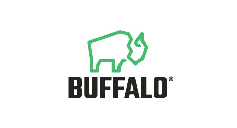
The buffalo figure is an iconic part of the brand and therefore the change had to be a delicate process. The new logo is the result of combining the original logo’s composition with a modern styling. The singular stroke throughout the logo symbolizes the strength and endurance in the company, while the unique angles give a familiar ‘tool’ look.
We hope you are as excited as we are about these changes and would love to hear your thoughts, suggestions and feedback. Please feel free to connect with us through social media or via email at sales@buffalo-tools.com.